57.1. Data Analytics
57.1.1. How to open DEFORM Data analytics wizard
57.1.2. Layout
57.1.3. Tool bar
57.1.4. Work area
57.1.5. Project tree
57.1.6. Property editor
57.1.7. General workflow
Opening DEFORM Data analytics
Data analytics can be accessed from the DEFORM/v13.x folder by opening the “DEF_GUI_DA_64.EXE”. DEFORM Data analytics wizard will be opened, Clicking on ![]() button will create a new DEFORM Data analytics project as shown in the Fig. 57.1.1.
button will create a new DEFORM Data analytics project as shown in the Fig. 57.1.1.
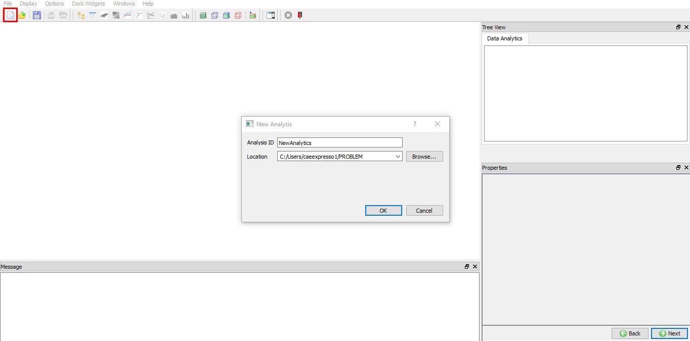
Creating a new data analytic project
Layout
DEFORM Data Analytics is divided into the following areas as shown in the Fig. 57.1.2.
Work area : The work area is where tabular data is displayed and edited. Plots are also displayed in this area.
Project Tree : Unlike many DEFORM project trees, which guide users through a setup process, the DEFORM Data Analytics project tree provides an outline of the data. It lists each data table and for each table it lists the data, model and expression columns.
Property Editor : The property editor allows the user to set properties of table columns and plots.
Message area : The Message are displays system information or errors related to the setup. The message area also shows the equation of a model (if appropriate) and statistics about the goodness of the fit. The text in the message area can be copied and pasted into a text editor.
Tool bar : The toolbar provides various icon buttons for file saving and loading, and plotting data. For more information refer 57.1.2.1. Tool bar options.
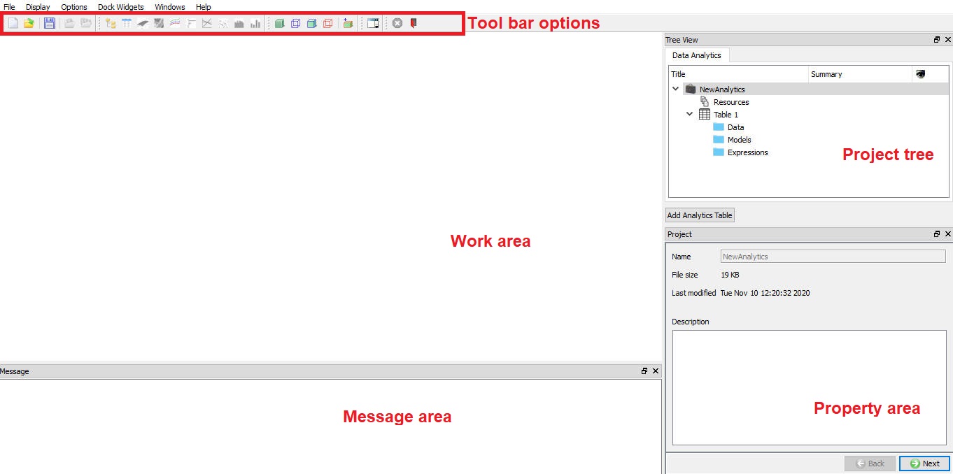
Data analytics layout
Tool bar
New File ![]() : The “New file” button is used to create the new DEFORM Data Analytics project.
: The “New file” button is used to create the new DEFORM Data Analytics project.
Open![]() : The open button is used to open an existing DEFORM Data Analytics project.
: The open button is used to open an existing DEFORM Data Analytics project.
Save ![]() : The save is used to store modifications made to the open DEFORM Data Analytics project.
: The save is used to store modifications made to the open DEFORM Data Analytics project.
Action file import![]() : Imports data from a file into the selected data table.
: Imports data from a file into the selected data table.
Import from multiple DB’s ![]() : Imports data from multiple DEFORM simulation databases into the selected data table.
: Imports data from multiple DEFORM simulation databases into the selected data table.
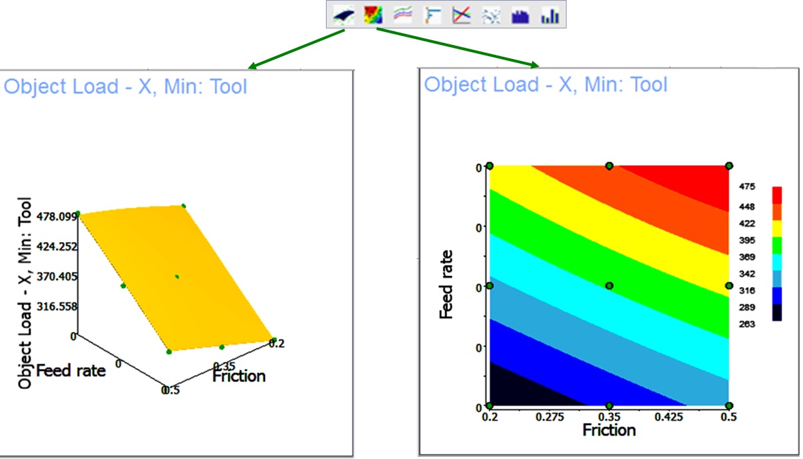
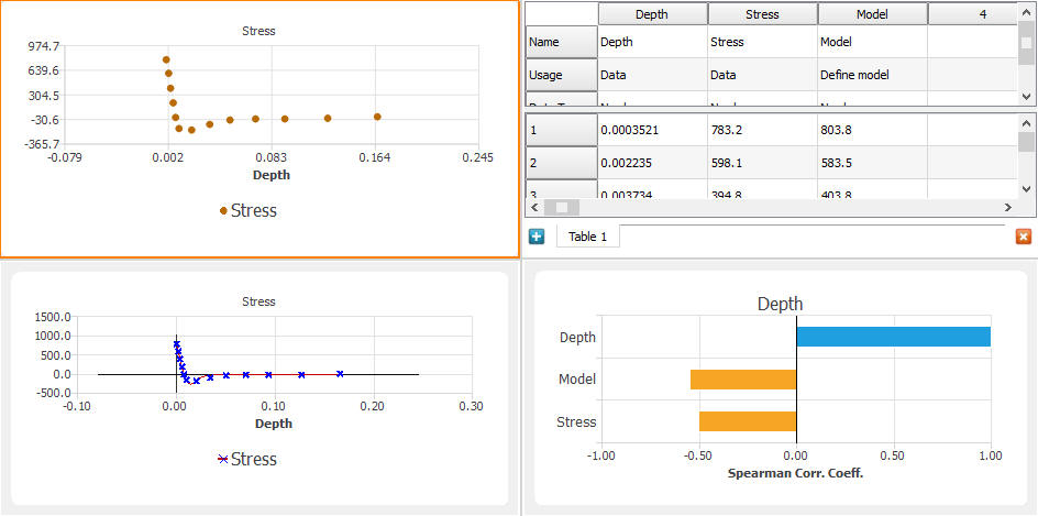
3d Response surface plot (![]() ): he 3d Response Surface Plot is only available when a trained model or evaluated expression column is selected. The model/expression also must have at least 2 inputs. This plot shows a 3d surface representing the output as a function of 2 of the inputs. The inputs can be selected from the properties area. The surface is created from the model. Dots show the location of the original data (used to train a model). These can be used to see how well the surface fits the data. Fig. 57.1.3. shows an example of this plot.
): he 3d Response Surface Plot is only available when a trained model or evaluated expression column is selected. The model/expression also must have at least 2 inputs. This plot shows a 3d surface representing the output as a function of 2 of the inputs. The inputs can be selected from the properties area. The surface is created from the model. Dots show the location of the original data (used to train a model). These can be used to see how well the surface fits the data. Fig. 57.1.3. shows an example of this plot.
Contour Response surface plot (![]() ): The contour Response Surface Plot is only available when a trained model or evaluated expression column is selected. The model/expression also must have at least 2 inputs. This plot shows a contour plot representing the output as a function of 2 of the inputs. The inputs can be selected from the properties area. Fig. 57.1.3. shows an example of this plot.
): The contour Response Surface Plot is only available when a trained model or evaluated expression column is selected. The model/expression also must have at least 2 inputs. This plot shows a contour plot representing the output as a function of 2 of the inputs. The inputs can be selected from the properties area. Fig. 57.1.3. shows an example of this plot.
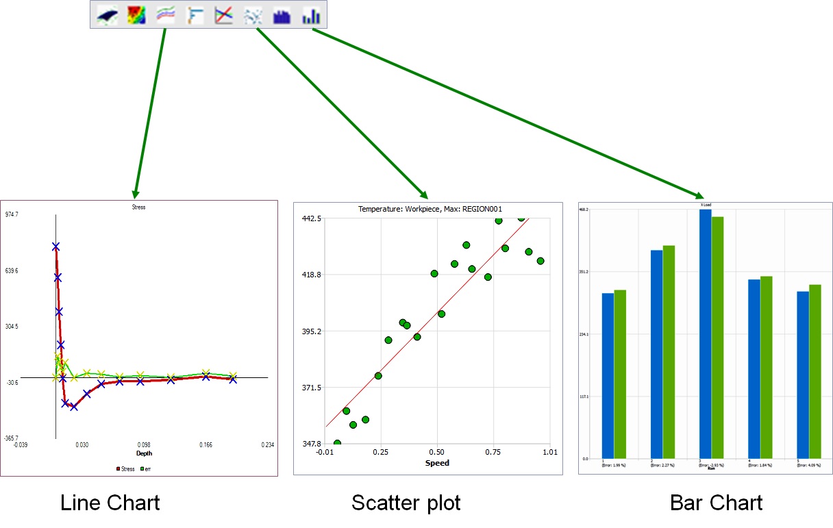
Line Plot (![]() ): The line plot plots one column of data against another. The data points as well as lines connecting the points are displayed. Multiple pairs of data can be plotted for comparison. The line plot can also be used to plot response surfaces where the model has only one input (this is actually a response curve).
): The line plot plots one column of data against another. The data points as well as lines connecting the points are displayed. Multiple pairs of data can be plotted for comparison. The line plot can also be used to plot response surfaces where the model has only one input (this is actually a response curve).
Scatter Plot (![]() ): The scatter plot plots one column of data against another without conntecting lines. A line of best fit can optionally be displayed.
): The scatter plot plots one column of data against another without conntecting lines. A line of best fit can optionally be displayed.
Bar Plot (![]() ): The bar plot shows the value of each data point of a column as a bar. Multiple columns can be selected to compare values.
): The bar plot shows the value of each data point of a column as a bar. Multiple columns can be selected to compare values.
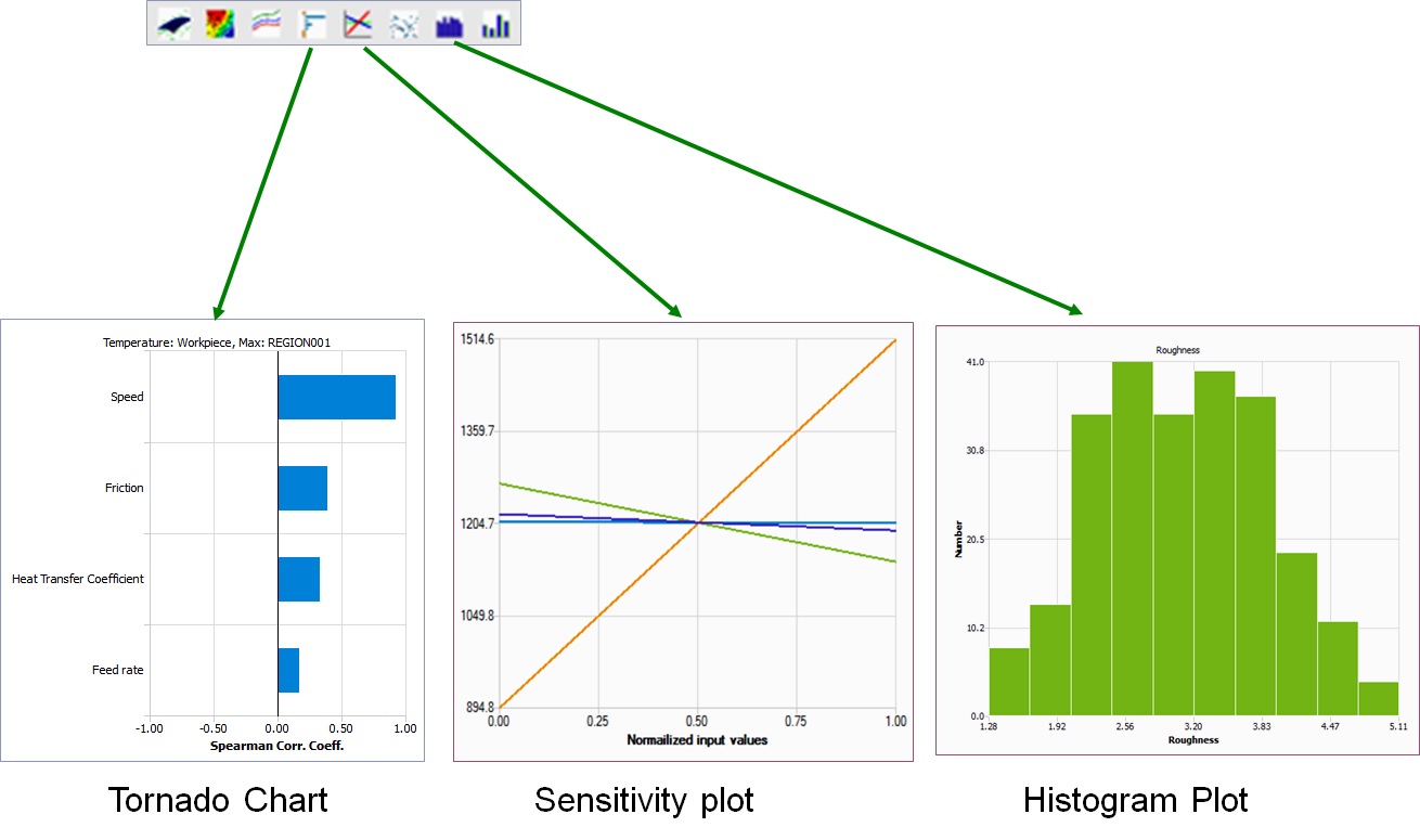
Tornado Plot (![]() ): The tornado chart compares all columns to a selected column. The length of each bar shows a measure of the correlation between the data in each column to the selected column. The bars are ordered from highly correlated (at the top) to uncorrelated (at the bottom).
): The tornado chart compares all columns to a selected column. The length of each bar shows a measure of the correlation between the data in each column to the selected column. The bars are ordered from highly correlated (at the top) to uncorrelated (at the bottom).
Sensitivity Plo t (![]() ): The sensitivity plot also compares all columns to a selected column. The correlation is shown as a slope of a line.
): The sensitivity plot also compares all columns to a selected column. The correlation is shown as a slope of a line.
Histogram Plot (![]() ): The histogram plot shows a count of values for one column of data in user specified ranges of values. This can provide a visual look at the probability of a variable being within a certain range.
): The histogram plot shows a count of values for one column of data in user specified ranges of values. This can provide a visual look at the probability of a variable being within a certain range.
Response surface plots
Visualization plots
Analysis plots
Work area
The work area displays data tables and plots as shown in Fig. 57.1.6. When the work area contains multiple windows, the active window is outlined in orange. The properties area will show the properties page for the active window. The active window is changed by clicking in a window.
When multiple windows are shown in the work area, they can be arranged by selecting a layout from the ![]() icon on the tool bar. Each layout has a main screen (usually the largest area or the upper right).
icon on the tool bar. Each layout has a main screen (usually the largest area or the upper right).
Each window has a context menu (accessed by right mouse click). The items in the menu are:
Show title bar : When selected, each window in the work area will have a title bar. This menu item will change to Hide title bar.
The title bar will contain a title and 2 icons.
![]() : Clicking this icon will remove the window from the work area and allow it to be moved freely on the screen. To return a window to the work area, simply drag the window over the work area. An area will open that the window can be dropped into.
: Clicking this icon will remove the window from the work area and allow it to be moved freely on the screen. To return a window to the work area, simply drag the window over the work area. An area will open that the window can be dropped into.
![]() : Clicking this icon will close the window.
: Clicking this icon will close the window.
Move to main screen : Moves the window to the main screen.
Close view : Closes the window.
Multiple windows opened in work area
Project tree
The project tree is divided into 2 parts as shown in Fig. 57.1.7.
Resources is a folder for storing and organizing reference material and data. This material can contain data tables, images, and links to external files. Folders can be added to help organize this data.
Tables are used to analyze and model data. Each table entry in the tree shows the columns of data organized by “usage”. Different types of data usages are Data, Models and Expressions.
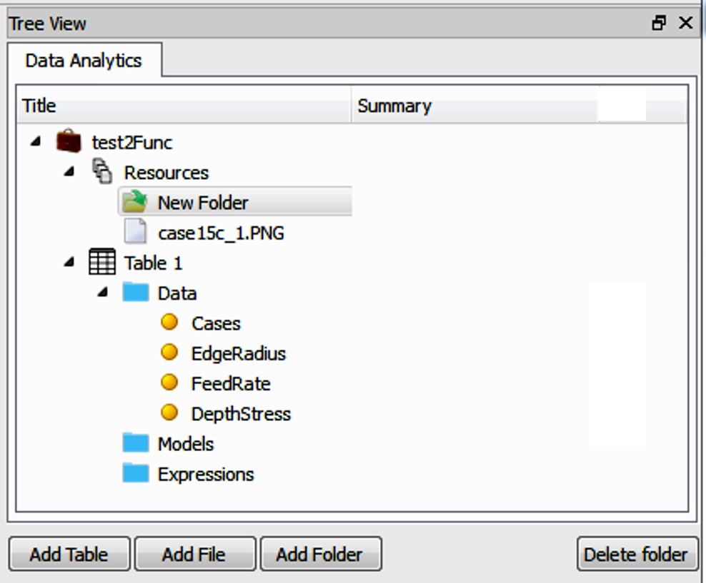
Project tree
Property editor
The property editor is used to specify model controls, expression controls and descriptions that can be added at several tree levels to describe the project, table, etc. or to simply save additional information. The properties area will show the properties page for the active window.
General workflow
Most DEFORM Data Analytics projects will follow the workflow outlined below. DEFORM Data Analytics does not require these step be performed in this order. (although some data needs to be entered before it can be analyzed or modeled). Some steps may be slipped altogether. A user may wish to enter some data, model it, then enter more data, etc. This is allowed.
Data Entry / Data Collection : Data is entered into a data table either by typing values directly into the table cells, or copying data from another file or another data table and pasting it into the table, or importing data from a file.
Data Organization : The data used can be organized based on the data usage into different folders and files. User can organize the data by adding folders and files and importing data into them in Resources section. Data within a data table can be copied/pasted from one column to another. Missing data can be filled in. Outliers can be marked for exclusion from modeling.
Data Analysis : Data within a data table can be visualized using various plots. The visualization may plots help a user to understand the behavior of various data defined and build model.
Data Modeling : Models can be defined to define input/output relationships between columns of data. Expressions can be created to transform data (i.e. units change, scale change or coordinate system change) or combine data.
Model Validation : After training the model, error statistics of the model can be viewed. Plots can be used to visualize the output of the model.
Prediction : Using the new model user can predict the output for new input values.